Displaying Geo-Spatial Data with R
Martin Schweinberger
2021-09-29
Introduction
This tutorial introduces geo-spatial data visualization in R. The entire R markdown document for this tutorial can be downloaded here.
This tutorial is based on R. If you have not installed R or are new to it, you will find an introduction to and more information how to use R here. For this tutorials, we need to install certain packages from an R library so that the scripts shown below are executed without errors. Before turning to the code below, please install the packages by running the code below this paragraph. If you have already installed the packages mentioned below, then you can skip ahead and ignore this section. To install the necessary packages, simply run the following code.
NOTE
The installation of the packages may take some time (between 5 and 10 minutes!). The installation will also require data from your plan - it is thus recommendable to be logged into an institutional network that has a decent connectivity and download rate (e.g., a university network). The issue is caused by the fact that some of the required packages contain shape files that are render the packages to be rather over-proportionally big in comparison to other R packages. Also, due to their size, the shape files and the packages that contain them they take time to download
# install packages
install.packages("OpenStreetMap")
install.packages("DT")
install.packages("RColorBrewer")
install.packages("mapproj")
install.packages("sf")
install.packages("RgoogleMaps")
install.packages("scales")
install.packages("rworldmap")
install.packages("maps")
install.packages("tidyverse")
install.packages("rnaturalearth")
install.packages("rnaturalearthdata")
install.packages("rgeos")
install.packages("ggspatial")
install.packages("maptools")
install.packages("leaflet")
install.packages("sf")
install.packages("tmap")
install.packages("here")
install.packages("rgdal")
install.packages("scales")
install.packages("flextable")
# install package from github
devtools::install_github("dkahle/ggmap", ref = "tidyup")
# install klippy for copy-to-clipboard button in code chunks
remotes::install_github("rlesur/klippy")
# set options
options(stringsAsFactors = F) # no automatic data transformation
options("scipen" = 100, "digits" = 4) # suppress math annotation
op <- options(gvis.plot.tag='chart') # set gViz options
# load package
library(OpenStreetMap)
library(DT)
library(RColorBrewer)
library(mapproj)
library(sf)
library(RgoogleMaps)
library(scales)
library(rworldmap)
library(maps)
library(tidyverse)
library(rnaturalearth)
library(rnaturalearthdata)
library(rgeos)
library(ggspatial)
library(maptools)
library(leaflet)
library(sf)
library(tmap)
library(here)
library(rgdal)
library(scales)
library(flextable)
# activate klippy for copy-to-clipboard button
klippy::klippy()Depending on the maps that are used in the visualization, it may also be necessary to access other data bases. One very useful data base for maps is, of course, Google Maps. However, to access Google Maps materials, installation and setting up other pieces of software is necessary. How to get access to Google’s data is discussed below. In the following section, methods that do not require installation of software other than R.
1 Getting started with maps
The most basic way to display geospatial data is to simply download and display a map. In order to do that, we load the libraries necessary for extracting and plotting the map.
The package OpenStreetMap offers a range of maps with different features. To access the OpenStreetMap data base, it is necessary to install the package. Once the package is installed, we can simply extract the map and define the region we want to plot by defining the longitude and latitude of the upper left and lower right corner of the region we want to display. The argument minNumTiles defines the accuracy of the map, the higher the number of tiles, the higher the resolution. The type of map is defined by the type argument. The type argument defines from which server the map is extracted. Once we have extracted a map, we can plot it using the “plot” function.
# extract map
AustraliaMap <- openmap(c(-8,110),
    c(-45,160),
#   type = "osm",
#   type = "esri",
    type = "nps",
    minNumTiles=7)
# plot map
plot(AustraliaMap)
In order to obtain different map types, we change the type argument. The following options are available for type:
opt <- c("osm", "osm-bw","maptoolkit-topo", "waze", "bing", "stamen-toner", "stamen-terrain", "stamen-watercolor", "osm-german", "osm-wanderreitkarte", "mapbox")
opt2 <- c("esri", "esri-topo", "nps", "apple-iphoto", "skobbler", "hillshade", "opencyclemap", "osm-transport", "osm-public-transport", "osm-bbike", "osm-bbike-german")
opt <- data.frame(opt, opt2) %>%
  dplyr::rename(options = colnames(.)[1],
                more = colnames(.)[2])
opt %>%
as.data.frame() %>%
head(15) %>%
flextable() %>%
flextable::set_table_properties(width = .5, layout = "autofit") %>%
flextable::theme_zebra() %>%
flextable::fontsize(size = 12) %>%
flextable::fontsize(size = 12, part = "header") %>%
flextable::align_text_col(align = "center") %>%
flextable::set_caption(caption = "Map display options.") %>%
flextable::border_outer()options | more |
osm | esri |
osm-bw | esri-topo |
maptoolkit-topo | nps |
waze | apple-iphoto |
bing | skobbler |
stamen-toner | hillshade |
stamen-terrain | opencyclemap |
stamen-watercolor | osm-transport |
osm-german | osm-public-transport |
osm-wanderreitkarte | osm-bbike |
mapbox | osm-bbike-german |
Unfortunately, not all options work. If they do not work, then an error message is shown telling us that the number of tiles is not supported.
We can zoom in or out by either changing the “zoom” or the “minNumTiles” arguments - in both cases, the higher the number, the more fine-grained the dispalyed map. Let’s check out some examples for maps of Queensland.
# extract map
queensland1 <- openmap(c(-8,135),
    c(-30,160),
    type = "osm",
    minNumTiles=6)
queensland2 <- openmap(c(-8,135),
    c(-30,160),
    type = "esri",
    minNumTiles=6)
# plot maps
par(mfrow = c(1, 2)) # display plots in 1 row/2 columns
plot(queensland1); plot(queensland2); par(mfrow = c(1, 1)) # restore original settings
Generating maps with rworldmap and base R
Another data base that is very useful when certain maps is the rworldmap package. The rworldmap package contains the shape files for countries but also more fine grained-shape files that display the states of selected countries. The most basic data, however, simply represents the shapes of the countries in the world.
Using the worldmap package has the advantage that one is not dependent on third parties and their servers but can operate within R without being denied access due to e.g. copy right issues or server maintenance.
# load library
library(rworldmap)
# get map
worldmap <- getMap(resolution = "coarse")
# plot world map
plot(worldmap, col = "lightgrey",
     fill = T, border = "darkgray",
     xlim = c(-180, 180), ylim = c(-90, 90),
     bg = "aliceblue",
     asp = 1, wrap=c(-180,180))
The basic map shown above can then be modified and enriched with color coding to convey geospatial data. The following shows how to customize the world map.
# load package
library(maps)
# plot maps
# show map with Latitude 200 as center
maps::map('world', xlim = c(100, 300))
# add axes
maps::map.axes()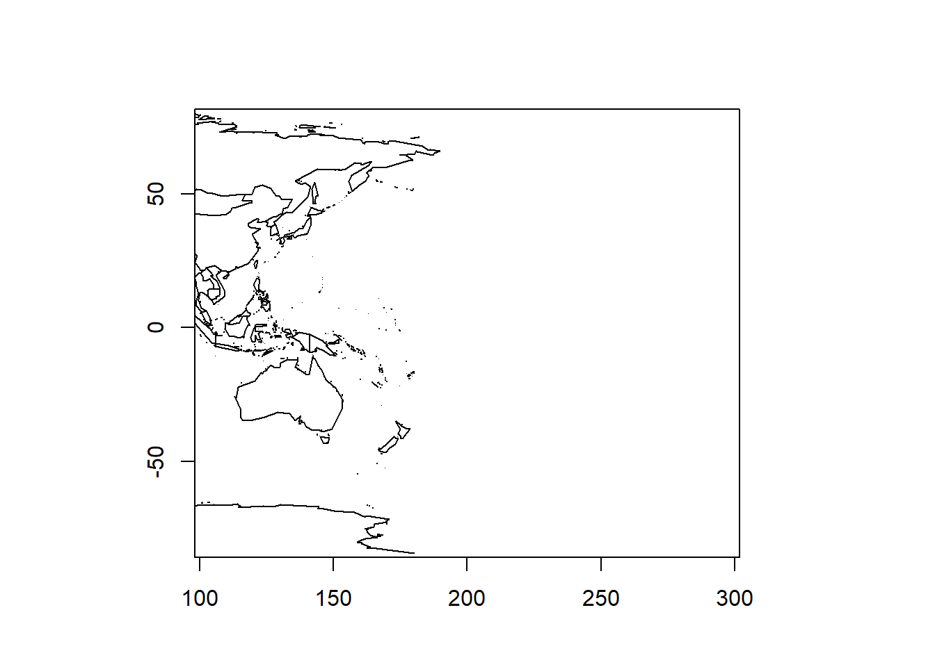
# show filled map with Latitude 200 as center
ww2 <- maps::map('world', wrap=c(0,360), plot=FALSE, fill=TRUE)
maps::map(ww2, xlim = c(100, 300), fill=TRUE)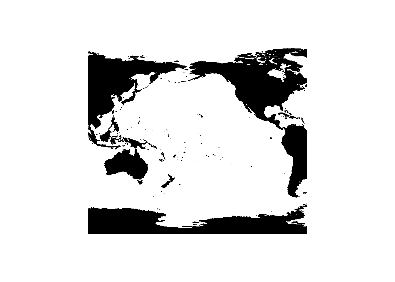
Generating maps with rnaturalearth and ggplot2
We can also use the data provided by the rnaturalearth and the rnaturalearthdata and use ggplot function from the ggplot2 package as well as the sf package to create very nice visualizations of geospatial data. The advantage over using rworldmap and base R lies in the fact that the code is easier to interpret and the visualizations are more appealing.
# load data
world <- ne_countries(scale = "medium", returnclass = "sf")
# gene world map
ggplot(data = world) +
  geom_sf() +
  labs( x = "Longitude", y = "Latitude") +
  ggtitle("World map", subtitle = paste0("(", length(unique(world$admin)), " countries)"))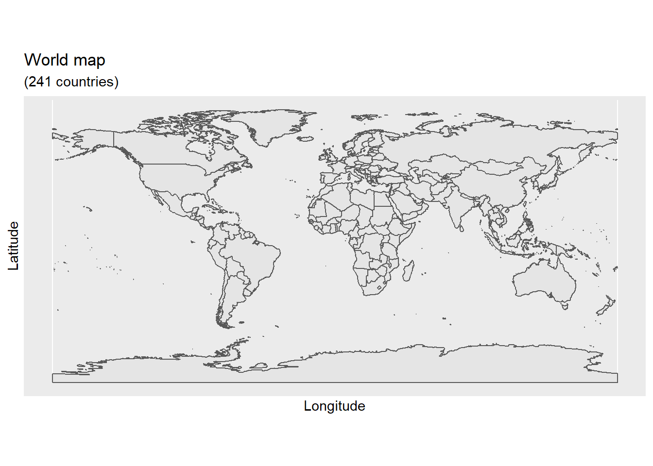
We can also easily zoom in on certain areas in the map using the coord_sf function and also prettify the map by adding some custom features such as a compass.
# gene world map
ggplot(data = world) +
  geom_sf() +
  labs( x = "Longitude", y = "Latitude") +
  coord_sf(xlim = c(100.00, 160.00), ylim = c(-45.00, -10.00), expand = T) +
  annotation_scale(location = "bl", width_hint = 0.5) +
  annotation_north_arrow(location = "bl", which_north = "true",
                         pad_x = unit(0.75, "in"), pad_y = unit(0.5, "in"),
                         style = north_arrow_fancy_orienteering) +
  theme_bw()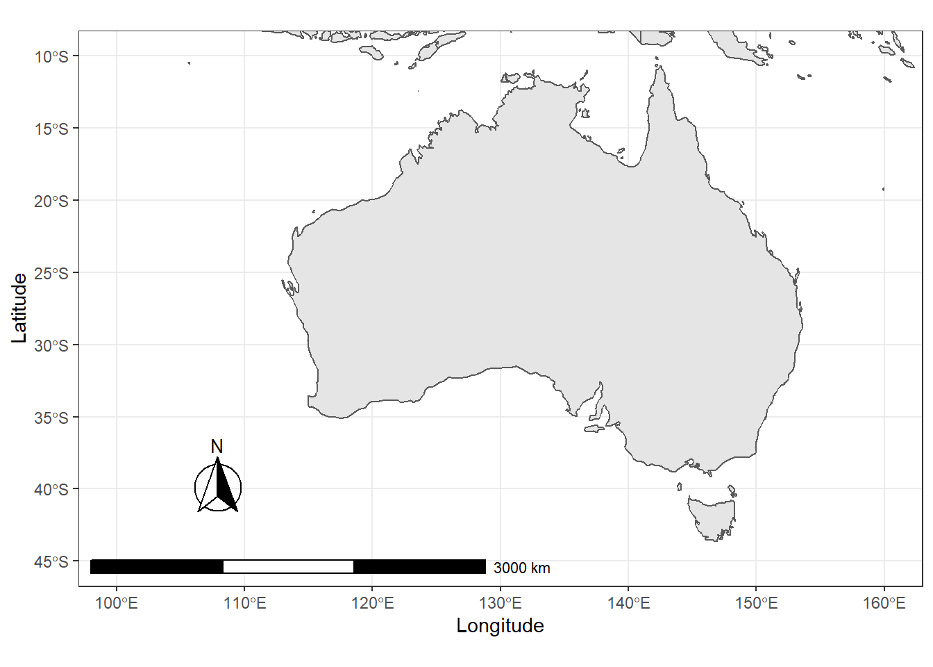
We will now customize these basic maps and add information to them.
2 Customizing Maps
Displaying basic maps is usually less interesting because, typically, we want to add different layers to a map. In order to add layers to a map, we need to have a shape file, i.e. a file which contains information about borders or locations that can then be displayed in different colors. In other words, we need to have a shape object to add information to the map.
However, it is often the case that we want to add information that is not already available. Therefore, we load the airports data set which contains the longitude and latitude of airports across the world. We will then use this data to show the locations of airports across the globe.
# load data
airports <- base::readRDS(url("https://slcladal.github.io/data/apd.rda", "rb")) %>%
  dplyr::mutate(ID = as.character(ID))
airports %>%
as.data.frame() %>%
head(15) %>%
flextable() %>%
flextable::set_table_properties(width = .5, layout = "autofit") %>%
flextable::theme_zebra() %>%
flextable::fontsize(size = 12) %>%
flextable::fontsize(size = 12, part = "header") %>%
flextable::align_text_col(align = "center") %>%
flextable::set_caption(caption = "First 15 rows of the airports data.") %>%
flextable::border_outer()ID | Name | City | Country | Latitude | Longitude |
1 | Goroka Airport | Goroka | Papua New Guinea | -6.082 | 145.39 |
2 | Madang Airport | Madang | Papua New Guinea | -5.207 | 145.79 |
3 | Mount Hagen Kagamuga Airport | Mount Hagen | Papua New Guinea | -5.827 | 144.30 |
4 | Nadzab Airport | Nadzab | Papua New Guinea | -6.570 | 146.73 |
5 | Port Moresby Jacksons International Airport | Port Moresby | Papua New Guinea | -9.443 | 147.22 |
6 | Wewak International Airport | Wewak | Papua New Guinea | -3.584 | 143.67 |
7 | Narsarsuaq Airport | Narssarssuaq | Greenland | 61.160 | -45.43 |
8 | Godthaab / Nuuk Airport | Godthaab | Greenland | 64.191 | -51.68 |
9 | Kangerlussuaq Airport | Sondrestrom | Greenland | 67.012 | -50.71 |
10 | Thule Air Base | Thule | Greenland | 76.531 | -68.70 |
11 | Akureyri Airport | Akureyri | Iceland | 65.660 | -18.07 |
12 | Egilsstaðir Airport | Egilsstadir | Iceland | 65.283 | -14.40 |
13 | Hornafjörður Airport | Hofn | Iceland | 64.296 | -15.23 |
14 | HúsavÃk Airport | Husavik | Iceland | 65.952 | -17.43 |
15 | Ãsafjörður Airport | Isafjordur | Iceland | 66.058 | -23.14 |
To display the locations of airports on a map, we first plot the map and then add a layer of points to indicate the location of airports. In addition, the “plot” functions offers various arguments for customizing the display, e.g. by changing the background color (bg), defining the color of borders (borders), defining the color of the shapes (fill and col).
# plot data on world map
plot(worldmap, xlim = c(-80, 160), ylim = c(-50, 100),
     asp = 1, bg = "lightblue", col = "black", fill = T)
# add points
points(airports$Longitude, airports$Latitude,
       col = "red", cex = .01)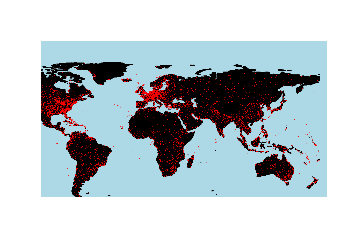
It is, of course, also possible to highlight individual countries.
# create data frame with iso3 country codes and number of visits
countriesvisited <- data.frame(country = c("AUS", "JPN", "FIN",
                                           "CZE", "POL", "AUT",
                                           "USA", "GBR", "IRL",
                                           "DEU", "DNK", "FRA",
                                           "NDL", "BEL", "ESP",
                                           "HRV", "SVN", "NOR",
                                           "ITA", "HUN", "ROU",
                                           "BGR", "GRC", "TUR",
                                           "CHE", "ARE"),
  visited = c(5, 1, 2, 1, 1, 3, 4, 4, 5, 11, 1, 1, 2, 2, 4, 4,
              1, 1, 3, 1, 1, 2, 1, 1, 3, 2))
countriesvisited %>%
as.data.frame() %>%
head(15) %>%
flextable() %>%
flextable::set_table_properties(width = .5, layout = "autofit") %>%
flextable::theme_zebra() %>%
flextable::fontsize(size = 12) %>%
flextable::fontsize(size = 12, part = "header") %>%
flextable::align_text_col(align = "center") %>%
flextable::set_caption(caption = "First 15 rows of the countriesvisited data.") %>%
flextable::border_outer()country | visited |
AUS | 5 |
JPN | 1 |
FIN | 2 |
CZE | 1 |
POL | 1 |
AUT | 3 |
USA | 4 |
GBR | 4 |
IRL | 5 |
DEU | 11 |
DNK | 1 |
FRA | 1 |
NDL | 2 |
BEL | 2 |
ESP | 4 |
# combine data frame with map
visitedMap <- joinCountryData2Map(countriesvisited,
                                  joinCode = "ISO3",
                                  nameJoinColumn = "country")
## 25 codes from your data successfully matched countries in the map
## 1 codes from your data failed to match with a country code in the map
## 218 codes from the map weren't represented in your data# def. map parameters, e.g. def. colors
mapParams <- mapCountryData(visitedMap,
nameColumnToPlot="visited",
oceanCol = "azure2",
catMethod = "categorical",
missingCountryCol = gray(.8),
colourPalette = c("coral",
"coral2",
"coral3", "orangered",
"orangered3", "orangered4"),
addLegend = F,
mapTitle = "",
border = NA)
# add legend and display map
do.call(addMapLegendBoxes, c(mapParams,
x = 'bottom',
title = "No. of visits",
horiz = TRUE,
bg = "transparent",
bty = "n"))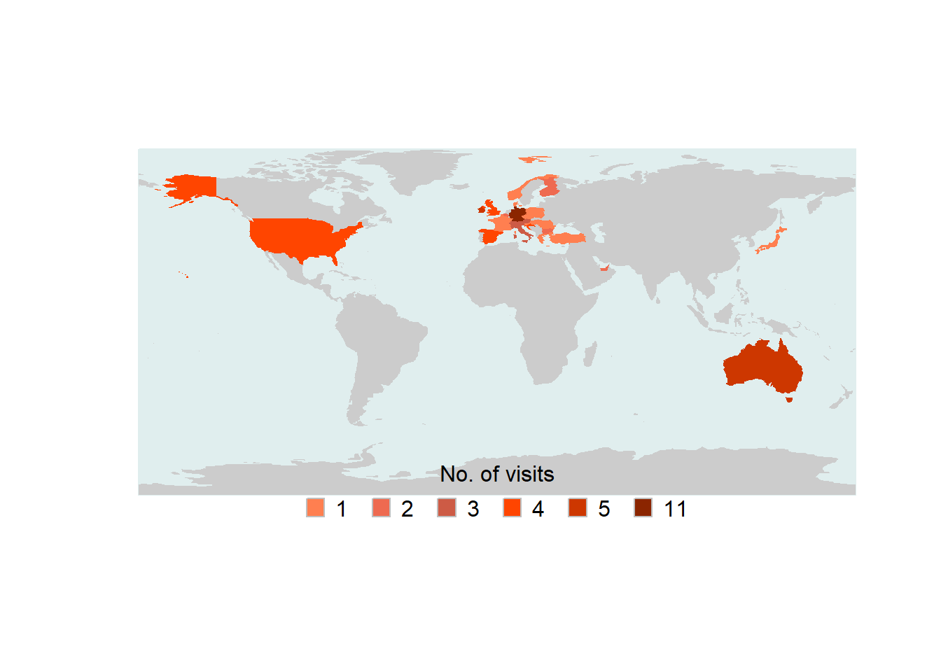
It is, of course also possible to show only a part of the map by defining the x- and y-axes limits of the plot window.
# get map
newmap <- getMap(resolution = "low")
# plot map
plot(newmap, xlim = c(-20, 59), ylim = c(35, 71),
     asp = 1, fill = T, border = "darkgray",
     col = "wheat2", bg = "gray95")
# add points
points(airports$Longitude, airports$Latitude, col = "red", cex = .5, pch = 20)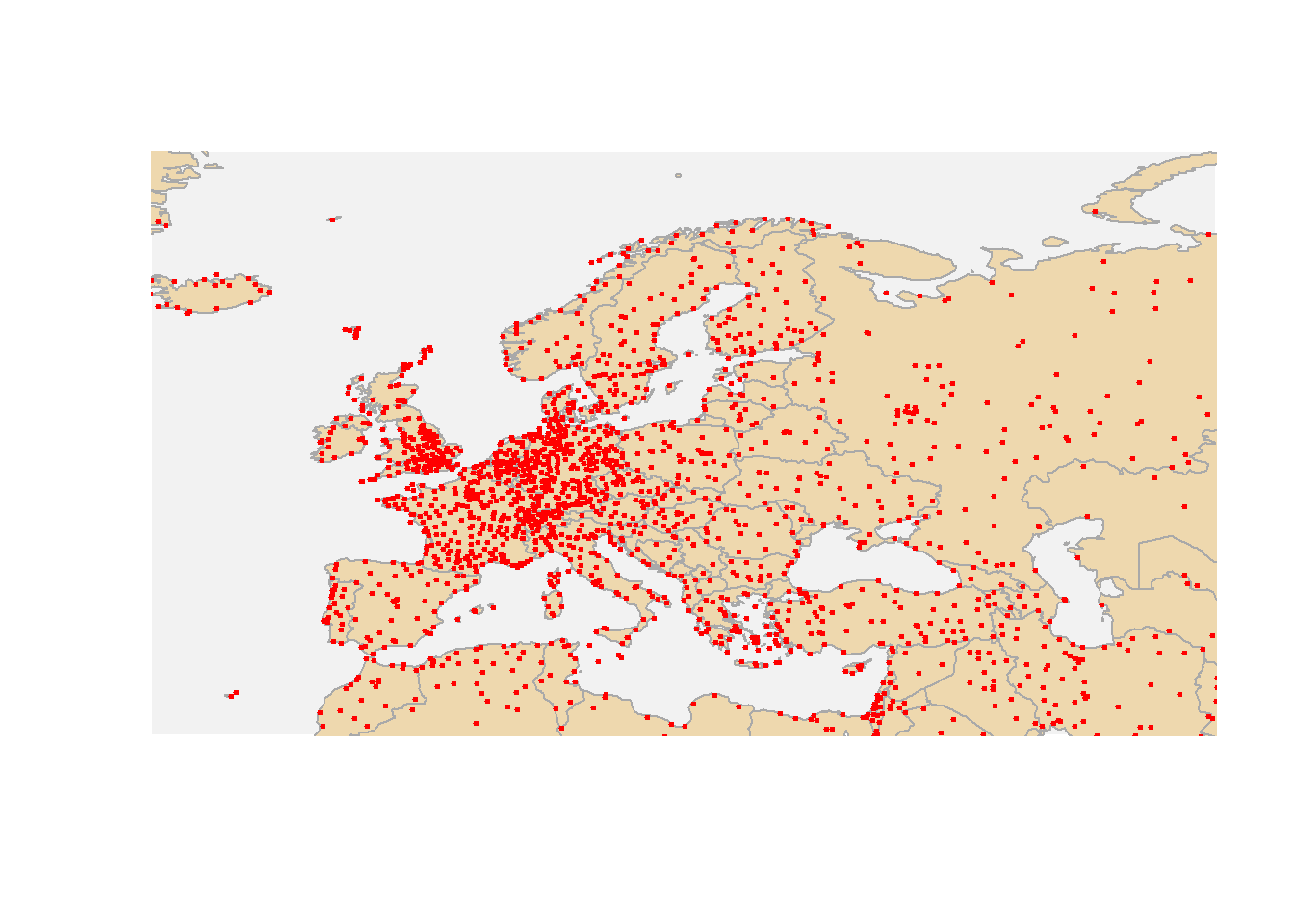
This is of course also possible to show Australian airports.
# plot data on world map
plot(worldmap, xlim = c(110, 160), ylim = c(-45, -10),
     asp = 1, bg = "azure2", border = "lightgrey", col = "wheat1",
     fill = T, wrap=c(-180,180))
points(airports$Longitude, airports$Latitude,
       col = "darkblue", cex = .5, pch = 20)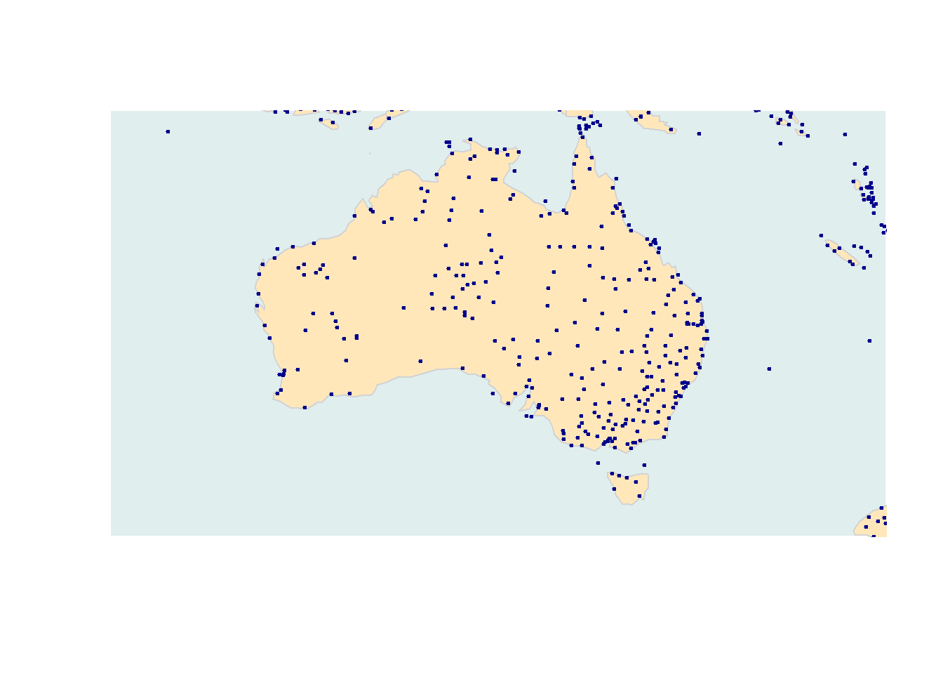
In addition to the location of airports, it is also possible to show how many flights arrive at an airport. As this information is not provided in the airport data, we load the routes data which contains information about the routes that airlines fly.
# read in routes data
routes <- base::readRDS(url("https://slcladal.github.io/data/ard.rda", "rb"))
routes %>%
as.data.frame() %>%
head(15) %>%
flextable() %>%
flextable::set_table_properties(width = .5, layout = "autofit") %>%
flextable::theme_zebra() %>%
flextable::fontsize(size = 12) %>%
flextable::fontsize(size = 12, part = "header") %>%
flextable::align_text_col(align = "center") %>%
flextable::set_caption(caption = "First 15 rows of the routes data.") %>%
flextable::border_outer()airline | airlineID | sourceAirport | sourceAirportID | destinationAirport | destinationAirportID |
2B | 410 | AER | 2965 | KZN | 2990 |
2B | 410 | ASF | 2966 | KZN | 2990 |
2B | 410 | ASF | 2966 | MRV | 2962 |
2B | 410 | CEK | 2968 | KZN | 2990 |
2B | 410 | CEK | 2968 | OVB | 4078 |
2B | 410 | DME | 4029 | KZN | 2990 |
2B | 410 | DME | 4029 | NBC | 6969 |
2B | 410 | DME | 4029 | TGK | \N |
2B | 410 | DME | 4029 | UUA | 6160 |
2B | 410 | EGO | 6156 | KGD | 2952 |
2B | 410 | EGO | 6156 | KZN | 2990 |
2B | 410 | GYD | 2922 | NBC | 6969 |
2B | 410 | KGD | 2952 | EGO | 6156 |
2B | 410 | KZN | 2990 | AER | 2965 |
2B | 410 | KZN | 2990 | ASF | 2966 |
To show the number of arrivals at an airport (only in terms of how mayn routes end at that airport), we extract the number of routes that end in each airport.
# extract number of flights per airport
arrivals <- routes %>%
  dplyr::group_by(destinationAirportID) %>%
  dplyr::summarise(flights = n()) %>%
  dplyr::ungroup() %>%
  dplyr::rename(ID = destinationAirportID)
arrivals %>%
as.data.frame() %>%
head(15) %>%
flextable() %>%
flextable::set_table_properties(width = .5, layout = "autofit") %>%
flextable::theme_zebra() %>%
flextable::fontsize(size = 12) %>%
flextable::fontsize(size = 12, part = "header") %>%
flextable::align_text_col(align = "center") %>%
flextable::set_caption(caption = "First 15 rows of the arrivals data.") %>%
flextable::border_outer()ID | flights |
\N | 221 |
1 | 5 |
10 | 2 |
100 | 44 |
1001 | 4 |
1004 | 7 |
1005 | 31 |
10119 | 1 |
1013 | 5 |
1016 | 13 |
10160 | 2 |
1018 | 1 |
1020 | 28 |
1026 | 3 |
1028 | 1 |
We can now merge the airports and the arrival data set to combine the information about the location with the information about the number of routes that end at each airport.
# combine tables
airportA <- dplyr::left_join(airports, arrivals, by = "ID")
airportA %>%
as.data.frame() %>%
head(15) %>%
flextable() %>%
flextable::set_table_properties(width = .5, layout = "autofit") %>%
flextable::theme_zebra() %>%
flextable::fontsize(size = 12) %>%
flextable::fontsize(size = 12, part = "header") %>%
flextable::align_text_col(align = "center") %>%
flextable::set_caption(caption = "First 15 rows of the airportA data.") %>%
flextable::border_outer()ID | Name | City | Country | Latitude | Longitude | flights |
1 | Goroka Airport | Goroka | Papua New Guinea | -6.082 | 145.39 | 5 |
2 | Madang Airport | Madang | Papua New Guinea | -5.207 | 145.79 | 8 |
3 | Mount Hagen Kagamuga Airport | Mount Hagen | Papua New Guinea | -5.827 | 144.30 | 12 |
4 | Nadzab Airport | Nadzab | Papua New Guinea | -6.570 | 146.73 | 11 |
5 | Port Moresby Jacksons International Airport | Port Moresby | Papua New Guinea | -9.443 | 147.22 | 50 |
6 | Wewak International Airport | Wewak | Papua New Guinea | -3.584 | 143.67 | 6 |
7 | Narsarsuaq Airport | Narssarssuaq | Greenland | 61.160 | -45.43 | 5 |
8 | Godthaab / Nuuk Airport | Godthaab | Greenland | 64.191 | -51.68 | 9 |
9 | Kangerlussuaq Airport | Sondrestrom | Greenland | 67.012 | -50.71 | 8 |
10 | Thule Air Base | Thule | Greenland | 76.531 | -68.70 | 2 |
11 | Akureyri Airport | Akureyri | Iceland | 65.660 | -18.07 | 1 |
12 | Egilsstaðir Airport | Egilsstadir | Iceland | 65.283 | -14.40 | 1 |
13 | Hornafjörður Airport | Hofn | Iceland | 64.296 | -15.23 | |
14 | HúsavÃk Airport | Husavik | Iceland | 65.952 | -17.43 | |
15 | Ãsafjörður Airport | Isafjordur | Iceland | 66.058 | -23.14 | 1 |
This table allows us to plot not only the location of airports but also the number of routes that end there.
# get map
australia <- getMap(resolution = "low")
# plot data on world map
plot(australia, xlim = c(110, 160), ylim = c(-45, -10),
     asp = 1, bg = "azure1", border = "darkgrey",
     col = "wheat2", fill = T)
# add points
points(airportA$Longitude, airportA$Latitude,
       # define colors as transparent
       col = rgb(red = 0, green = 0, blue = 1, alpha = 0.3),
       # define size as number of flights div. by 50
       cex = airportA$flights/50, pch = 20)
The same map can also be created using the ggplot2 package which offers a very high degree of flexibility and allows for easy customization.
# create a layer of borders
ggplot(airportA, aes(x=Longitude, y= Latitude)) +
  borders("world", colour=NA, fill="wheat1")  +
  geom_point(color="blue", alpha = .2, size = airportA$flights/20) +
  scale_x_continuous(name="Longitude", limits=c(110, 160)) +
  scale_y_continuous(name="Latitude", limits=c(-45, -10)) +
  theme(panel.background = element_rect(fill = "azure1", colour = "azure1")) +
  geom_text(aes(x=Longitude, y= Latitude, label=City),
            color = "gray20", check_overlap = T, size = 3)
In addition, it may be useful to overlay an area with shading to indicate the density of airports orflights.
# create map with density layer
ggplot(airportA, (aes(x = Longitude, y= Latitude))) +
  borders("world", colour=NA, fill="antiquewhite")  +
  stat_density2d(aes(fill = ..level..,  alpha = I(.2)),
                 size = 1, bins = 5, data = airportA,
                 geom = "polygon") +
  geom_point(color="red", alpha = .2, size=airportA$flights/100) +
  # define color of density polygons
  scale_fill_gradient(low = "grey50", high = "grey20") +
  theme(panel.background = element_rect(fill = "lightblue",
                                colour = "lightblue"),
        panel.grid.major = element_blank(),
        panel.grid.minor = element_blank(),
        # surpress legend
        legend.position = "none",
        axis.line=element_blank(),
        axis.text.x=element_blank(),
        axis.text.y=element_blank(),
        axis.ticks=element_blank(),
        axis.title.x=element_blank(),
        axis.title.y=element_blank()) +
  geom_text(aes(x=Longitude, y= Latitude, label=Name),
            color = "gray20", fontface = "italic", check_overlap = T, size = 2,
            alpha = sqrt(airportA$flights)/10)
You can also overlay maps to show densities (e.g. of airports) as shown below.
# load library
library(ggmap)
# define box
sbbox <- make_bbox(lon = c(115, 155), lat = c(-12.5, -42), f = .1)
# get map
ausbg = get_map(location=sbbox, zoom=4,

                # possible sources
                source = "osm",
                #source = "google",
                #source = "stamen",

                # possible coloring
                #color = "bw",
                color = "color",

                # possible maptypes
                maptype="satellite")
                #maptype="terrain")
                #maptype="terrain-background")
                #maptype="hybrid")
                #maptype="toner")
                #maptype="hybrid")
                #maptype="terrain-labels")
                #maptype="roadmap")
# create map
ausbg = ggmap(ausbg)
# display map
ausbg +
  stat_density2d(data = airportA, aes(x = Longitude, y= Latitude,
                     fill = ..level..,  alpha = I(.2)),
                 size = 1, bins = 5, geom = "polygon") +
  geom_point(data = airportA, mapping = aes(x=Longitude, y= Latitude),
             color="red", alpha = .2, size=airportA$flights/20) +
  # define color of density polygons
  scale_fill_gradient(low = "grey50", high = "grey20") +
  theme(axis.line=element_blank(),
        axis.text.x=element_blank(),
        axis.text.y=element_blank(),
        axis.ticks=element_blank(),
        axis.title.x=element_blank(),
        axis.title.y=element_blank(),
        panel.background = element_rect(fill = "aliceblue",
                                colour = "aliceblue"),
        panel.grid.major = element_blank(),
        panel.grid.minor = element_blank(),
        # surpress legend
        legend.position = "none")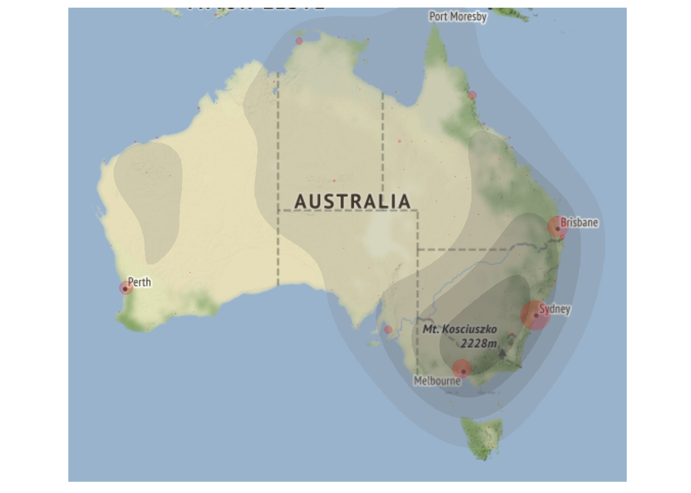
If you simply want to generate a map of a place, then you can use the ggmap package to do this.
# define box
sbbox <- make_bbox(lon = c(152.8, 153.4), lat = c(-27.1, -27.7), f = .1)
# get map
brisbane = get_map(location=sbbox, zoom=10, maptype="terrain")
# create map
brisbanemap = ggmap(brisbane)
# display map
brisbanemap +
  geom_point(data = airportA, mapping = aes(x = Longitude, y = Latitude),
               color = "red") +
  geom_text(data = airportA,
            mapping = aes(x = Longitude+0.1,
                          y = Latitude,
                          label = "Brisbane Airport"),
            size = 2, color = "gray20",
            fontface = "bold",
check_overlap = T) 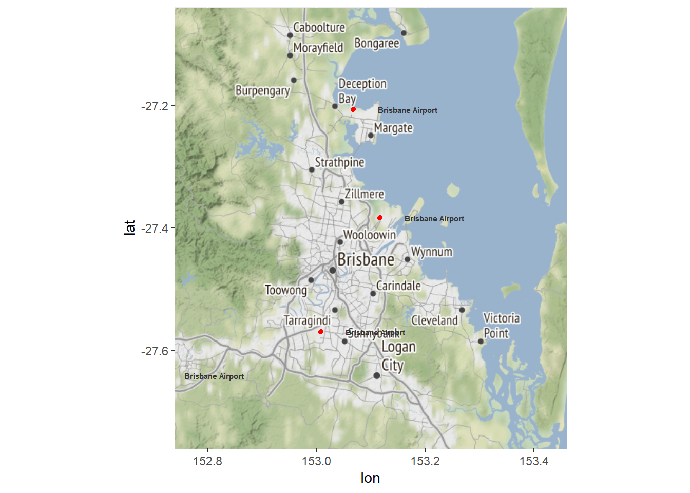
3 Color Coding Geospatial Information
We can also use color coding of countries to convey information about different features of countries such as their population size (or results of political elections, etc.).
We use the data provided in the rnaturalearthdata and rnaturalearth packages, which contain information about the population size of countries, to color code and thus visualize differences in population size by country.
# extract world data
world <- ne_countries(scale = "medium", returnclass = "sf")
# create cut off points in Population
world$pop_estC <- base::cut(world$pop_est,
                        breaks = c(0, 500000, 1000000, 10000000,
                                   100000000, 200000000, 500000000,
                                   10000000000),
                        labels = 1:7, right = F, ordered_result = T)
# load package for colors
library(RColorBrewer)
# define colors
palette = colorRampPalette(brewer.pal(n=7, name='Oranges'))(7)
palette = c("white", palette)
# create map
worldpopmap <- ggplot() +
  geom_sf(data = world, aes(fill = pop_estC)) +
  scale_fill_manual(values = palette) +
  # customize legend title
  labs(fill = "Population Size") +
  theme(panel.grid.major = element_blank(),
        panel.grid.minor = element_blank(),
        # surpress legend
        legend.position = "none")
# display map
worldpopmap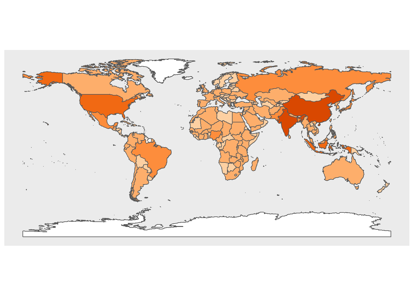
We can also scale the colors and add a legend to assist with the interpretation of the map.
# start plot
ggplot(data = world) +
    geom_sf(aes(fill = pop_est)) +
  scale_fill_viridis_c(option = "plasma", trans = "sqrt") +
  # customize legend title
  labs(fill = "Population Size")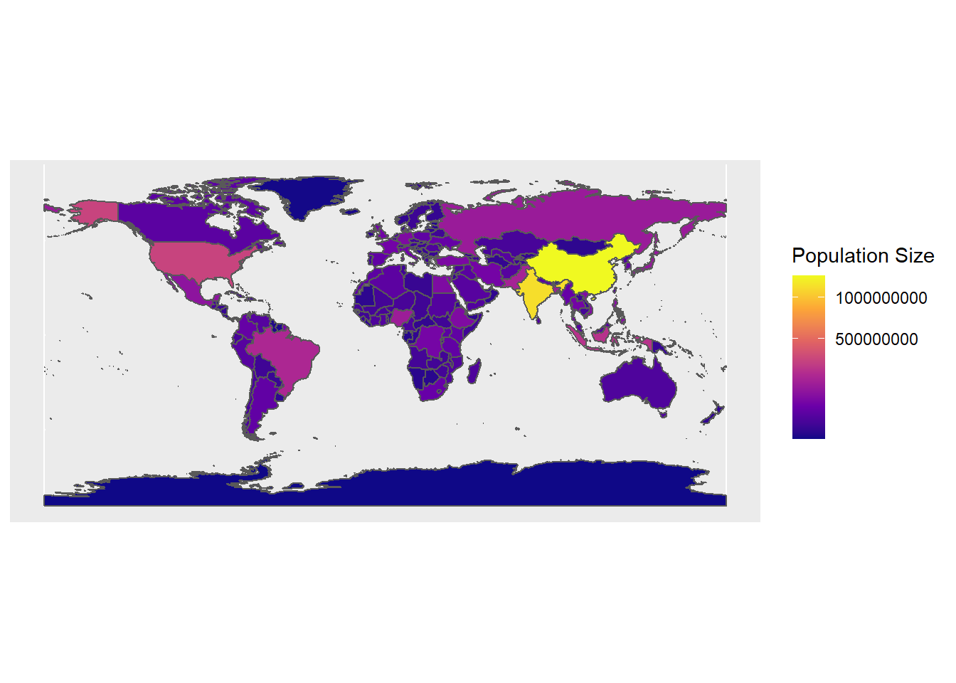
It is relatively easy to combine color coding with points. However, it is also relatively easy to color countries if all countries have values. If this is not the case (as in the example below), we need to include an additional step so that countries that are not mentioned also receive a color coding. In this example, the data contain countries and cities that I have visited along with their latitude and longitude.
# load data
visited <- base::readRDS(url("https://slcladal.github.io/data/vst.rda", "rb"))Country | ISO3 | City | Latitude | Longitude |
Australia | AUS | Adelaide | -34.94 | 138.600 |
Australia | AUS | Brisbane | -27.45 | 153.035 |
Australia | AUS | Canberra | -35.28 | 149.129 |
Australia | AUS | Melbourne | -37.82 | 144.975 |
Australia | AUS | Sydney | -33.92 | 151.185 |
Austria | AUT | Innsbruck | 47.28 | 11.410 |
Austria | AUT | Salzburg | 47.80 | 13.044 |
Austria | AUT | Vienna | 48.20 | 16.367 |
Belgium | BEL | Antwerpen | 51.22 | 4.415 |
Belgium | BEL | Leuven | 50.88 | 4.701 |
Bulgaria | BGR | Sofia | 42.70 | 23.320 |
Bulgaria | BGR | Varna | 43.20 | 27.911 |
Croatia | HRV | Djakovo | 45.31 | 18.410 |
Croatia | HRV | Novi Vinodolski | 45.13 | 14.789 |
Croatia | HRV | Rieka | 45.34 | 14.409 |
After loading the data, we determine how many cities I have visited in a given country and add this frequency to the data set.
# determine how often a country was visited
ncountry <- as.data.frame(table(visited$ISO3))
colnames(ncountry)[1] <- "ISO3"
# add frequency to visited
visited <- merge(visited, ncountry, by = "ISO3")ISO3 | Country | City | Latitude | Longitude | Freq |
ARE | United Arab Emirates | Abu Dhabi | 24.47 | 54.367 | 2 |
ARE | United Arab Emirates | Dubai | 25.23 | 55.280 | 2 |
AUS | Australia | Adelaide | -34.94 | 138.600 | 5 |
AUS | Australia | Brisbane | -27.45 | 153.035 | 5 |
AUS | Australia | Canberra | -35.28 | 149.129 | 5 |
AUS | Australia | Melbourne | -37.82 | 144.975 | 5 |
AUS | Australia | Sydney | -33.92 | 151.185 | 5 |
AUT | Austria | Innsbruck | 47.28 | 11.410 | 3 |
AUT | Austria | Salzburg | 47.80 | 13.044 | 3 |
AUT | Austria | Vienna | 48.20 | 16.367 | 3 |
BEL | Belgium | Antwerpen | 51.22 | 4.415 | 2 |
BEL | Belgium | Leuven | 50.88 | 4.701 | 2 |
BGR | Bulgaria | Sofia | 42.70 | 23.320 | 2 |
BGR | Bulgaria | Varna | 43.20 | 27.911 | 2 |
CHE | Switzerland | Basel | 47.58 | 7.590 | 2 |
The next part is tricky as we do not only need to determine the color for the countries I have visited but also the color for those that I have not visited. In order to do that, we load the data set that underlies the world map that will be displayed.
# load package
library(maptools)
# load world data for plotting
data(wrld_simpl)
# def. color (bias for contrast)
pal <- colorRampPalette(brewer.pal(6, 'Greens'),
                        bias = 10)(length(visited$Freq))
pal <- pal[with(visited, findInterval(Freq, sort(unique(Freq))))]
# define color for countries not in visited
countrycolor <- rep("white", length(wrld_simpl@data$NAME))
# define colors for countries in visited
countrycolor[match(visited$Country, wrld_simpl@data$NAME)] <- pal
After assigning colors to all countries, we can proceed by plotting the color coded map along with points for the locations of the cities I have visited.
# plot map
plot(wrld_simpl, ylim=c(-40, 85), xlim = c(-180, 180),
     mar=c(0,0,0,0), bg="gray40", border = NA,
     col=countrycolor)
# add points
points(visited$Longitude, visited$Latitude, col="red", pch=20, cex = .5)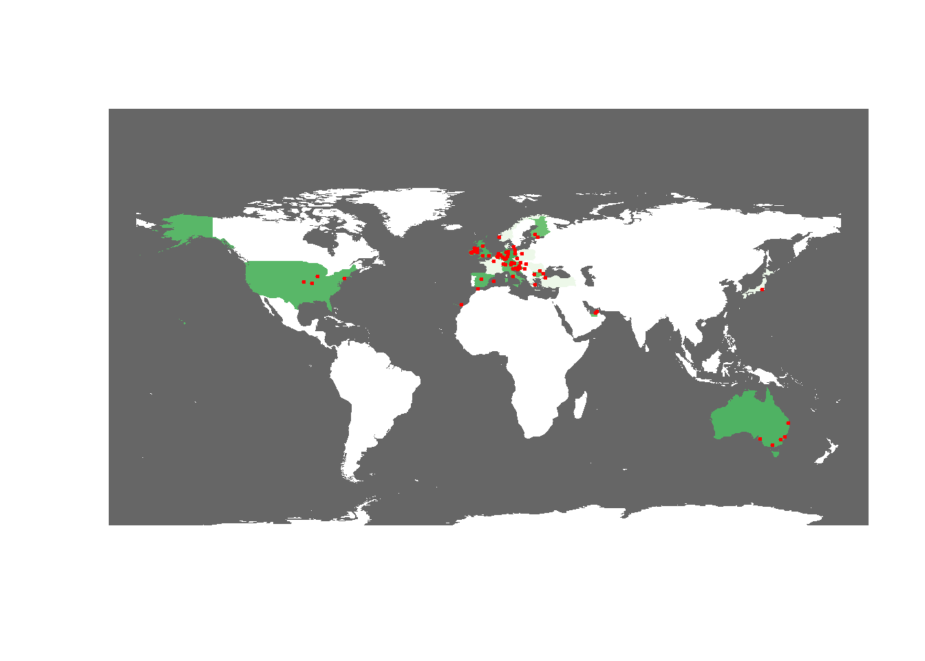
A slightly more elegent way to achive the same goal is to plot the information using the ggplot2 package.
# use the contry name instead of 3-letter ISO as id
wrld_simpl@data$id <- wrld_simpl@data$NAME
wrld <- fortify(wrld_simpl, region="id") %>%
  dplyr::filter(id != "Antarctica")
# change column names of visited
visited <- visited %>%
  dplyr::rename(id = Country)
# combine visited and wrld
worlddata <- dplyr::left_join(wrld, visited, by = "id")
# change NA to 0
worlddata <- worlddata %>%
  dplyr::mutate(Freq = ifelse(is.na(Freq), 0, Freq),
                Freq = as.factor(Freq))
# start plotting
ggmapplot <- ggplot() +
  geom_map(data=worlddata, map=worlddata,
           aes(map_id=id, x=long, y=lat,
           fill=Freq), color=NA, size=0.25) +
  geom_point(data = visited,
             aes(x = Longitude, y = Latitude),
             col = "red", size = .75) +
  scale_fill_manual(values=c("white", "gray80", "gray75",
                             "gray70",  "gray65", "gray60", "gray55"),
                    name="No. cities visited") +
#  coord_map("gilbert") +  # spherical
  coord_map() +           # for normal Mercator projection
  labs(x="", y="") +
  theme(plot.background = element_rect(fill = "grey40", colour = NA),
                   panel.border = element_blank(),
                   panel.background =
          element_rect(fill = "transparent", colour = NA),
                   panel.grid = element_blank(),
                   axis.text = element_blank(),
                   axis.ticks = element_blank(),
                   legend.position = "right")
ggmapplot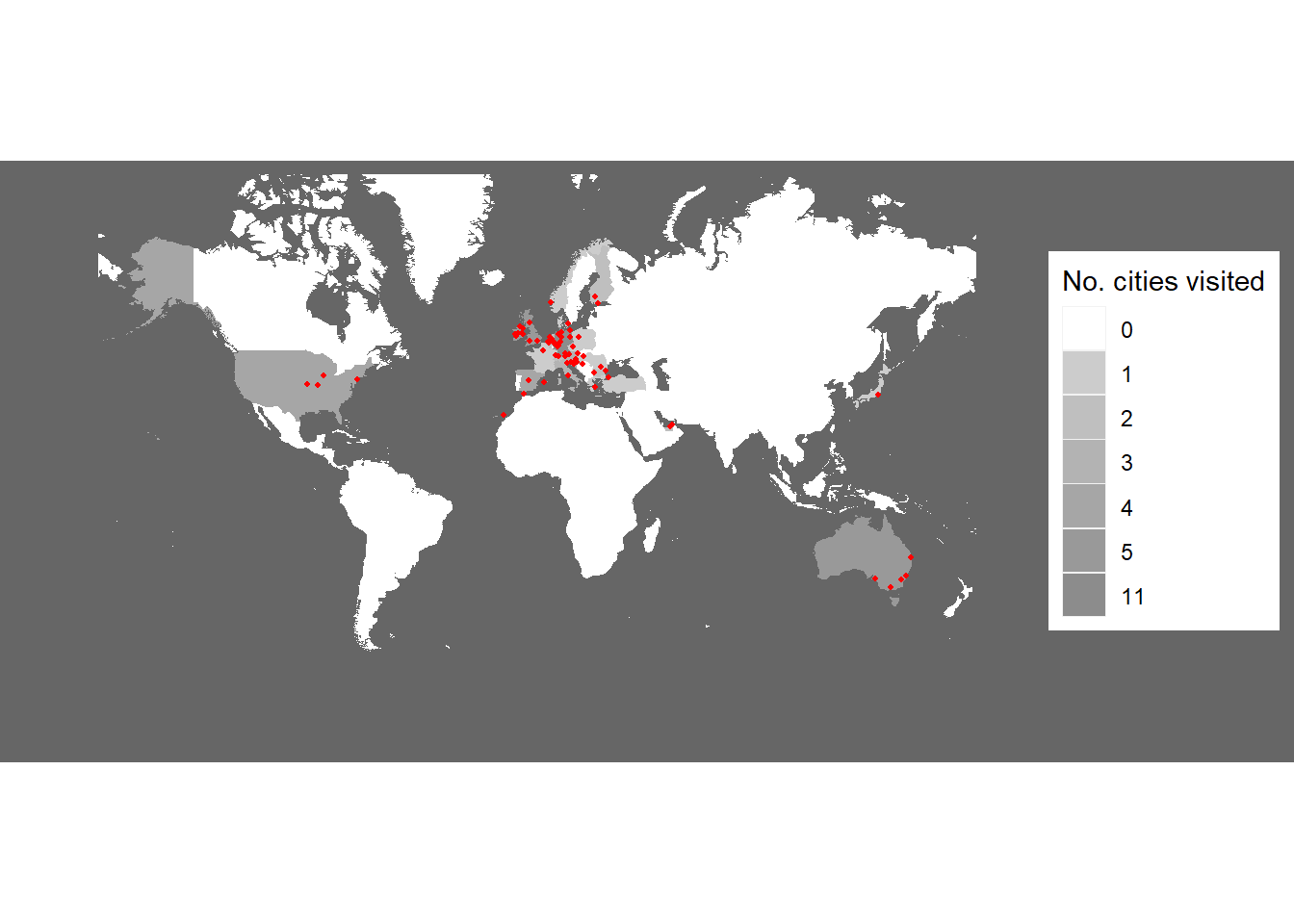
4 Interactive Maps
You can also use the leaflet package to create interactive maps. The leaflet function from the leaflet package creates a leaflet-map using html-widgets. The widget can be rendered on HTML pages generated from R Markdown, Shiny, or other applications. The advantage in using this function lies in the fact that it offers very detailed maps which enable zooming in to very specific locations.
# load package
library(leaflet)
# load library
m <- leaflet() %>% setView(lng = 153.05, lat = -27.45, zoom = 12)
# display map
m %>% addTiles()
Another option is to display information about different countries. In this case, we can use the information provided in the maptools package which comes with a SpatialPolygonsDataFrame of the world and the population by country (in 2005). To make the visualization a bit more appealing, we will calculate the population density, add this variable to the data which underlies the visualization, and then display the information interactively. In this case, this means that you can use mouse-over or hoover effects so that you see the population density in each country if you put the curser on that country (given the information is available for that country).
We start by loading the required package from the library, adding population density to the data, and removing data points without meaningful information (e.g. we set values like Inf to NA).
# load data
data(wrld_simpl)
# calculate population density and add it to the data
wrld_simpl@data$PopulationDensity <- round(wrld_simpl@data$POP2005/wrld_simpl@data$AREA,2)
wrld_simpl@data$PopulationDensity <- ifelse(wrld_simpl@data$PopulationDensity == "Inf", NA, wrld_simpl@data$PopulationDensity)
wrld_simpl@data$PopulationDensity <- ifelse(wrld_simpl@data$PopulationDensity == "NaN", NA, wrld_simpl@data$PopulationDensity)FIPS | ISO2 | ISO3 | UN | NAME | AREA | POP2005 | REGION | SUBREGION | LON | LAT | PopulationDensity |
AC | AG | ATG | 28 | Antigua and Barbuda | 44 | 83,039 | 19 | 29 | -61.783 | 17.08 | 1,887.25 |
AG | DZ | DZA | 12 | Algeria | 238,174 | 32,854,159 | 2 | 15 | 2.632 | 28.16 | 137.94 |
AJ | AZ | AZE | 31 | Azerbaijan | 8,260 | 8,352,021 | 142 | 145 | 47.395 | 40.43 | 1,011.14 |
AL | AL | ALB | 8 | Albania | 2,740 | 3,153,731 | 150 | 39 | 20.068 | 41.14 | 1,151.00 |
AM | AM | ARM | 51 | Armenia | 2,820 | 3,017,661 | 142 | 145 | 44.563 | 40.53 | 1,070.09 |
AO | AO | AGO | 24 | Angola | 124,670 | 16,095,214 | 2 | 17 | 17.544 | -12.30 | 129.10 |
AQ | AS | ASM | 16 | American Samoa | 20 | 64,051 | 9 | 61 | -170.730 | -14.32 | 3,202.55 |
AR | AR | ARG | 32 | Argentina | 273,669 | 38,747,148 | 19 | 5 | -65.167 | -35.38 | 141.58 |
AS | AU | AUS | 36 | Australia | 768,230 | 20,310,208 | 9 | 53 | 136.189 | -24.97 | 26.44 |
BA | BH | BHR | 48 | Bahrain | 71 | 724,788 | 142 | 145 | 50.562 | 26.02 | 10,208.28 |
BB | BB | BRB | 52 | Barbados | 43 | 291,933 | 19 | 29 | -59.559 | 13.15 | 6,789.14 |
BD | BM | BMU | 60 | Bermuda | 5 | 64,174 | 19 | 21 | -64.709 | 32.34 | 12,834.80 |
BF | BS | BHS | 44 | Bahamas | 1,001 | 323,295 | 19 | 29 | -78.014 | 24.63 | 322.97 |
BG | BD | BGD | 50 | Bangladesh | 13,017 | 15,328,112 | 142 | 34 | 89.941 | 24.22 | 1,177.55 |
BH | BZ | BLZ | 84 | Belize | 2,281 | 275,546 | 19 | 13 | -88.602 | 17.22 | 120.80 |
We can now display the data.
# define colors
qpal <- colorQuantile(rev(viridis::viridis(10)),
                      wrld_simpl$PopulationDensity, n=10)
# generate visualization
l <- leaflet(wrld_simpl, options =
               leafletOptions(attributionControl = FALSE, minzoom=1.5)) %>%
  addPolygons(
    label=~stringr::str_c(
      NAME, ' ',
      formatC(PopulationDensity, big.mark = ',', format='d')),
    labelOptions= labelOptions(direction = 'auto'),
    weight=1, color='#333333', opacity=1,
    fillColor = ~qpal(PopulationDensity), fillOpacity = 1,
    highlightOptions = highlightOptions(
      color='#000000', weight = 2,
      bringToFront = TRUE, sendToBack = TRUE)
    ) %>%
  addLegend(
    "topright", pal = qpal, values = ~PopulationDensity,
    title = htmltools::HTML("Population density <br> (2005)"),
    opacity = 1 )
# display visualization
l
5 Creating Maps with tmap and Shape Files
When creating more sophisticated maps, it is common to use shape files. Shape files define the edges of polygons and can be very complex depending on the number of edges of a polygon.
NOTE
You need to download the shape file from https://slcladal.github.io/data/shapes/AshmoreAndCartierIslands.shp and store it on your computer!
Once you have downloaded and stored the shp-file on your machine, you need to adapt the path so that R loads the shp-file from the location on your computer.
The path below works for my computer but it will not work for yours! You cannot download this shp-file from the GitHub repository and directly display it - you need to download it first.
We begin by loading the packages from the library and loading the shp-file into R. Once we have loaded the shp-file, we can simply plot it as shown below.
# load packages
library(tmap)
library(here)
# load shape file
ausstates <- sf::st_read(here::here("data/shapes", "AshmoreAndCartierIslands.shp"),
                         stringsAsFactors = F)
## Reading layer `AshmoreAndCartierIslands' from data source
## `D:\Uni\UQ\SLC\LADAL\SLCLADAL.github.io\data\shapes\AshmoreAndCartierIslands.shp'
## using driver `ESRI Shapefile'
## Simple feature collection with 15 features and 14 fields
## Geometry type: MULTIPOLYGON
## Dimension: XY
## Bounding box: xmin: 72.58 ymin: -54.78 xmax: 168 ymax: -9.141
## Geodetic CRS: WGS 84# plot australian admin shape file
tm_shape(ausstates) +
tmap_options(check.and.fix = TRUE) +
tm_fill() +
tm_borders()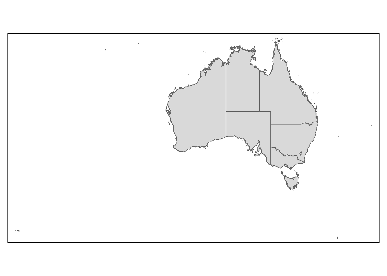
You can also load additional shape files are display them over the initial states. Below, we load shape-files for administrative districts which can be very interesting when analyzing voter behavior during elections.
NOTE
You you need to download the shape file from https://slcladal.github.io/data/shapes/AshmoreAndCartierIslands.shp as well as from https://slcladal.github.io/data/shapes/Australia_admin_6.shp and store them on your computer!
Once you have downloaded and stored the shp-files on your machine, you need to adapt the paths so that R loads the shp files from the locations on your computer.
The paths below work for my computer but they will not work for yours! You cannot download these shp-files from the GitHub repository directly when you generate the visualizations.
# load package
library(rgdal)
# load shape files
ozmap <- readOGR(dsn = here::here("data/shapes", "AshmoreAndCartierIslands.shp"), stringsAsFactors = F)
## OGR data source with driver: ESRI Shapefile
## Source: "D:\Uni\UQ\SLC\LADAL\SLCLADAL.github.io\data\shapes\AshmoreAndCartierIslands.shp", layer: "AshmoreAndCartierIslands"
## with 15 features
## It has 14 fieldsozadmin <- readOGR(dsn = here::here("data/shapes", "Australia_admin_6.shp"), stringsAsFactors = F)## OGR data source with driver: ESRI Shapefile
## Source: "D:\Uni\UQ\SLC\LADAL\SLCLADAL.github.io\data\shapes\Australia_admin_6.shp", layer: "Australia_admin_6"
## with 252 features
## It has 68 fields
## Integer64 fields read as strings: z_order# plot australia with administartive districts
ggplot() +
geom_polygon(data = ozmap,
aes(x = long, y = lat, group = group),
colour = "black", fill = "gray90") +
geom_polygon(data = ozadmin,
aes(x = long, y = lat, group = group),
colour = "red", fill = "gray80") +
theme_void()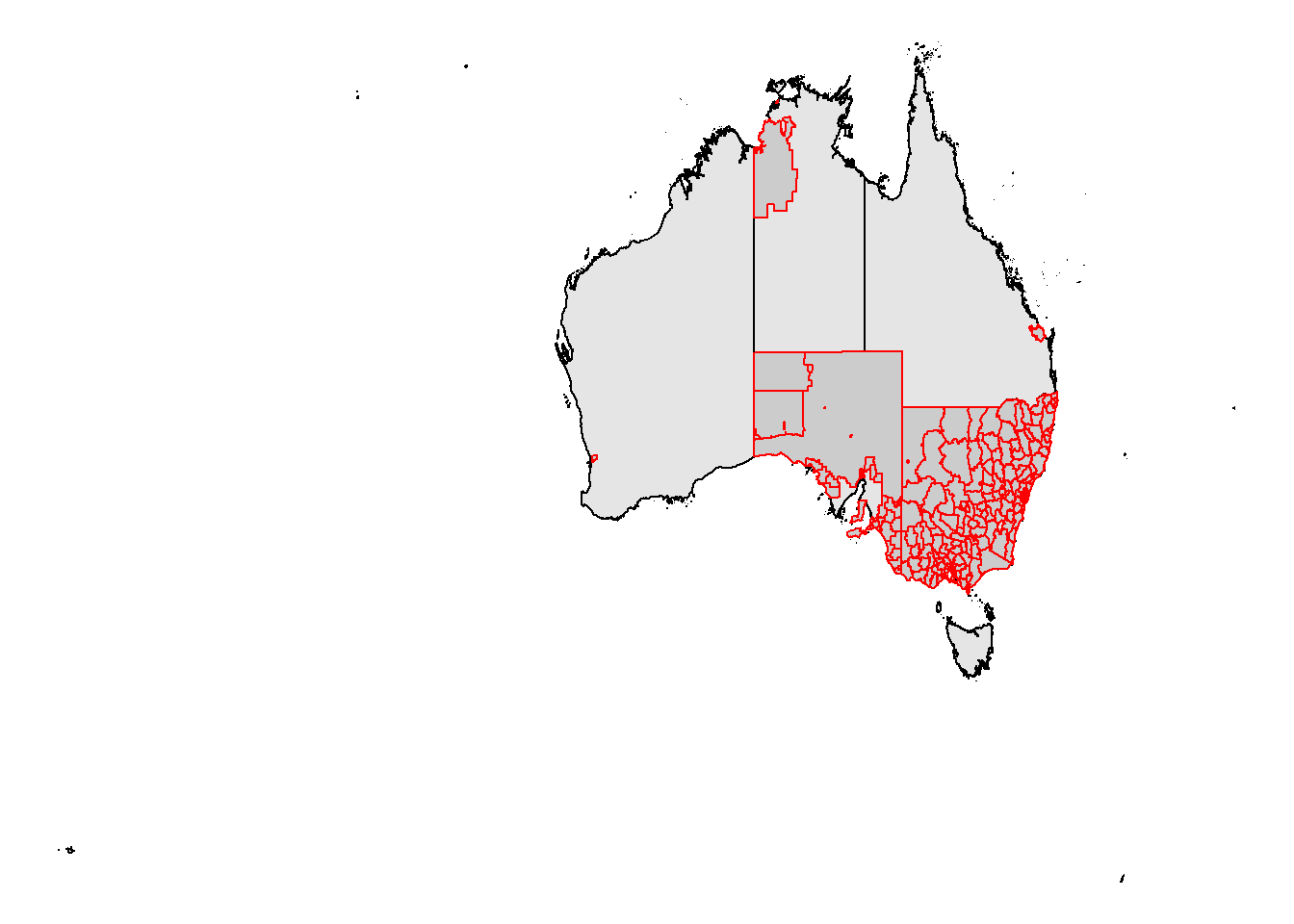
Shape-files re not as easily inspected as, for example, data frames or matrices. However, you can inspect shape elements as shown below to get a better understanding of their structure and what they contain.
# inspect shape file
summary(ozmap@data)
## id country name enname
## Min. : 82636 Length:15 Length:15 Length:15
## 1st Qu.:2316594 Class :character Class :character Class :character
## Median :2316598 Mode :character Mode :character Mode :character
## Mean :2251865
## 3rd Qu.:2363491
## Max. :3225677
## locname offname boundary adminlevel
## Length:15 Length:15 Length:15 Min. :4
## Class :character Class :character Class :character 1st Qu.:4
## Mode :character Mode :character Mode :character Median :4
## Mean :4
## 3rd Qu.:4
## Max. :4
## wikidata wikimedia timestamp note
## Length:15 Length:15 Length:15 Length:15
## Class :character Class :character Class :character Class :character
## Mode :character Mode :character Mode :character Mode :character
##
##
##
## rpath ISO3166_2
## Length:15 Length:15
## Class :character Class :character
## Mode :character Mode :character
##
##
## table(ozmap@data$name)##
## Ashmore and Cartier Islands Australian Capital Territory
## 1 1
## Christmas Island Cocos (Keeling) Islands
## 1 1
## Coral Sea Islands Territory Heard Island and McDonald Islands
## 1 1
## Jervis Bay Territory New South Wales
## 1 1
## Norfolk Island Northern Territory
## 1 1
## Queensland South Australia
## 1 1
## Tasmania Victoria
## 1 1
## Western Australia
## 1You can also modify the visualizations that you generate with shape-files. Here, we plot the names of the states above the map and also color-code the different states and territories. We begin by converting the data into a format that we can use.
# convert the data into tidy format
ozmapt <- broom::tidy(ozmap, region = "name")
# inspect data
head(ozmapt)
## # A tibble: 6 x 7
## long lat order hole piece group id
## <dbl> <dbl> <int> <lgl> <fct> <fct> <chr>
## 1 123. -12.2 1 FALSE 1 Ashmore and Cartier Islands.1 Ashmore and Carti~
## 2 123. -12.2 2 FALSE 1 Ashmore and Cartier Islands.1 Ashmore and Carti~
## 3 123. -12.2 3 FALSE 1 Ashmore and Cartier Islands.1 Ashmore and Carti~
## 4 123. -12.2 4 FALSE 1 Ashmore and Cartier Islands.1 Ashmore and Carti~
## 5 123. -12.2 5 FALSE 1 Ashmore and Cartier Islands.1 Ashmore and Carti~
## 6 123. -12.2 6 FALSE 1 Ashmore and Cartier Islands.1 Ashmore and Carti~Now, we extract the names of the states and territories as well as the longitudes and latitudes where we want to display the labels. Then, we display the information on the map.
# extract names of states and tehir long and lat
cnames <- ozmapt %>%
  dplyr::group_by(id) %>%
  dplyr::summarise(long = mean(long),
                   lat = mean(lat))
# define colors
library(scales)
clrs <- viridis_pal()(15)
# plot ozmap
p <- ggplot() +
  # plot map
  geom_polygon(data = ozmapt,
               aes(x = long, y = lat, group = group, fill = id),
               asp = 1, colour = NA) +
  # add text
  geom_text(data = cnames, aes(x = long, y = lat, label = id),
            size = 2, color = "gray20", fontface = "bold",
            check_overlap = T) +
  # color states
  scale_fill_manual(values = clrs) +
  # define theme and axes
  theme_void() +
  scale_x_continuous(name = "Longitude", limits = c(112, 155)) +
  scale_y_continuous(name = "Latitude", limits = c(-45, -10)) +
  # def. background color
  theme(panel.background = element_rect(fill = "slategray1",
                                        colour = "slategray1",
                                        size = 0.5, linetype = "solid"),
        legend.position = "none")
# show plot
p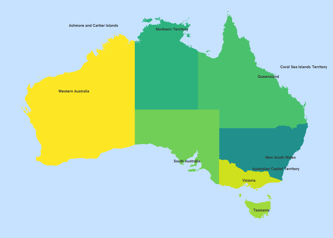
You can create customized polygons by defining longitudes and latitudes. In fact, you can generate very complex polygons like this. However, in this example, we only create a very basic one as a poof-of-concept.
# create data frame with longitude and latitude values
lat <- c(-25, -27.5, -25, -30, -30, -35, -25)
long <- c(150, 140, 130, 135, 140, 147.5, 150)
mypolygon <- as.data.frame(cbind(long, lat))
# inspect data
mypolygon
## long lat
## 1 150.0 -25.0
## 2 140.0 -27.5
## 3 130.0 -25.0
## 4 135.0 -30.0
## 5 140.0 -30.0
## 6 147.5 -35.0
## 7 150.0 -25.0We can now plot out polygon over the map produced above.
p +
  geom_polygon(data=mypolygon,
               aes(x = long, y = lat),
               alpha = 0.2,
               colour = "gray20",
               fill = "red") +
  ggplot2::annotate("text",
                    x = mean(long),
                    y = mean(lat),
                    label = "My Polygon Area",
                    colour="white",
                    size=3)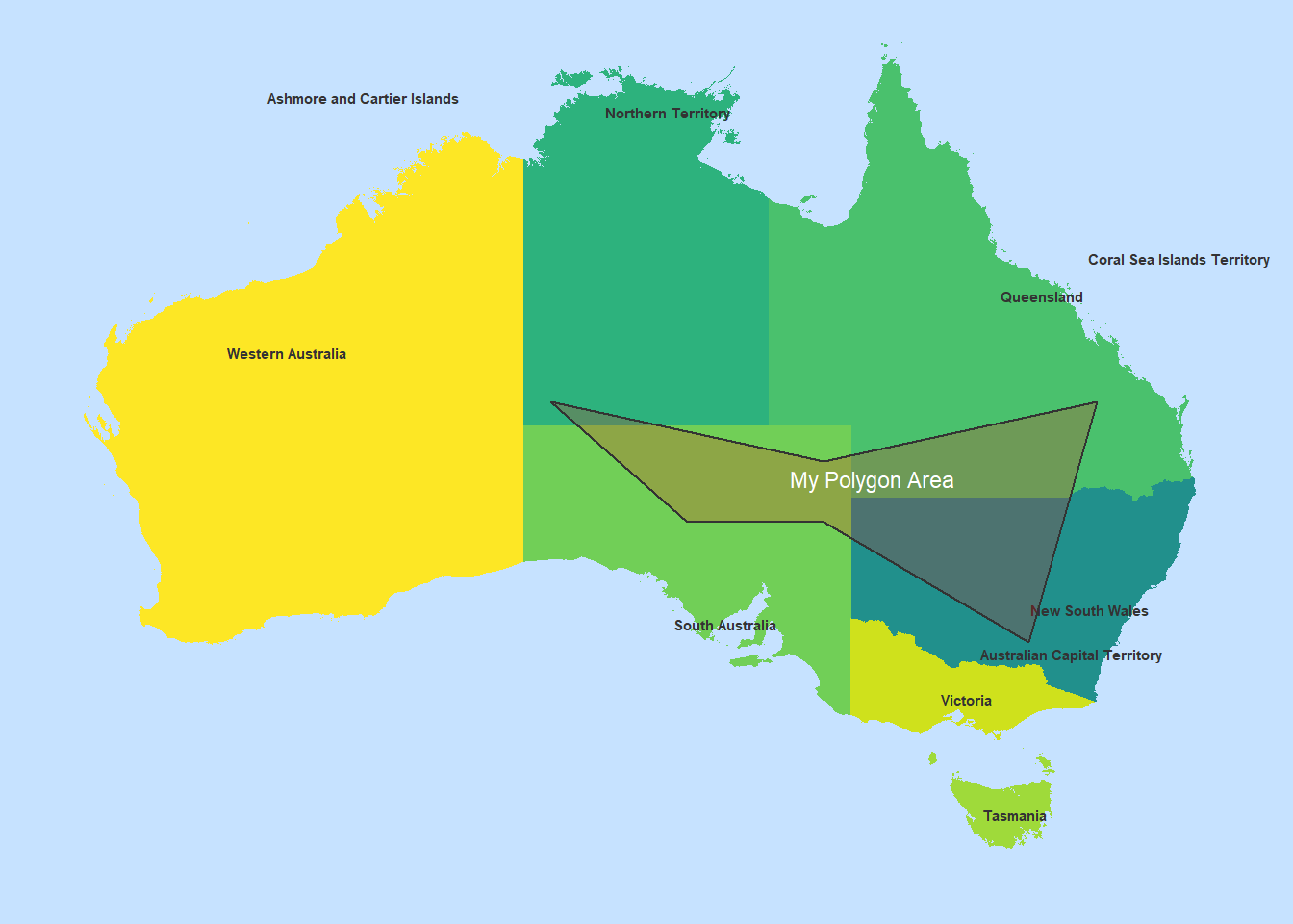
In a final step, we reset the graphics parameter that we customized at the beginning of this tutorial.
## Set options back to original options
options(op)
Citation & Session Info
Schweinberger, Martin. 2021. Displaying Geo-Spatial Data with R. Brisbane: The University of Queensland. url: https://slcladal.github.io/maps.html (Version 2021.09.29).
@manual{schweinberger2021maps,
  author = {Schweinberger, Martin},
  title = {Displaying Geo-Spatial Data with R},
  note = {https://slcladal.github.io/maps.html},
  year = {2021},
  organization = "The University of Queensland, Australia. School of Languages and Cultures},
  address = {Brisbane},
  edition = {2021.09.29}
}sessionInfo()## R version 4.1.1 (2021-08-10)
## Platform: x86_64-w64-mingw32/x64 (64-bit)
## Running under: Windows 10 x64 (build 19043)
##
## Matrix products: default
##
## locale:
## [1] LC_COLLATE=German_Germany.1252 LC_CTYPE=German_Germany.1252
## [3] LC_MONETARY=German_Germany.1252 LC_NUMERIC=C
## [5] LC_TIME=German_Germany.1252
##
## attached base packages:
## [1] stats graphics grDevices utils datasets methods base
##
## other attached packages:
## [1] ggmap_3.0.0 flextable_0.6.8 rgdal_1.5-27
## [4] here_1.0.1 tmap_3.3-2 leaflet_2.0.4.1
## [7] maptools_1.1-2 ggspatial_1.1.5 rgeos_0.5-8
## [10] rnaturalearthdata_0.1.0 rnaturalearth_0.1.0 forcats_0.5.1
## [13] stringr_1.4.0 dplyr_1.0.7 purrr_0.3.4
## [16] readr_2.0.1 tidyr_1.1.3 tibble_3.1.4
## [19] ggplot2_3.3.5 tidyverse_1.3.1 rworldmap_1.3-6
## [22] sp_1.4-5 scales_1.1.1 RgoogleMaps_1.4.5.3
## [25] sf_1.0-2 mapproj_1.2.7 maps_3.4.0
## [28] RColorBrewer_1.1-2 DT_0.19 OpenStreetMap_0.3.4
##
## loaded via a namespace (and not attached):
## [1] leafem_0.1.6 colorspace_2.0-2 rjson_0.2.20
## [4] ellipsis_0.3.2 class_7.3-19 rprojroot_2.0.2
## [7] base64enc_0.1-3 fs_1.5.0 dichromat_2.0-0
## [10] rstudioapi_0.13 proxy_0.4-26 farver_2.1.0
## [13] fansi_0.5.0 lubridate_1.7.10 xml2_1.3.2
## [16] codetools_0.2-18 knitr_1.34 spam_2.7-0
## [19] jsonlite_1.7.2 tmaptools_3.1-1 rJava_1.0-4
## [22] broom_0.7.9 dbplyr_2.1.1 png_0.1-7
## [25] compiler_4.1.1 httr_1.4.2 backports_1.2.1
## [28] assertthat_0.2.1 fastmap_1.1.0 cli_3.0.1
## [31] s2_1.0.7 leaflet.providers_1.9.0 htmltools_0.5.2
## [34] tools_4.1.1 dotCall64_1.0-1 gtable_0.3.0
## [37] glue_1.4.2 wk_0.5.0 Rcpp_1.0.7
## [40] cellranger_1.1.0 raster_3.4-13 vctrs_0.3.8
## [43] leafsync_0.1.0 crosstalk_1.1.1 lwgeom_0.2-7
## [46] xfun_0.26 rvest_1.0.1 lifecycle_1.0.0
## [49] XML_3.99-0.8 klippy_0.0.0.9500 MASS_7.3-54
## [52] hms_1.1.0 parallel_4.1.1 fields_12.5
## [55] curl_4.3.2 yaml_2.2.1 gridExtra_2.3
## [58] gdtools_0.2.3 stringi_1.7.4 highr_0.9
## [61] e1071_1.7-9 zip_2.2.0 bitops_1.0-7
## [64] rlang_0.4.11 pkgconfig_2.0.3 systemfonts_1.0.2
## [67] evaluate_0.14 lattice_0.20-44 labeling_0.4.2
## [70] htmlwidgets_1.5.4 tidyselect_1.1.1 plyr_1.8.6
## [73] magrittr_2.0.1 R6_2.5.1 generics_0.1.0
## [76] DBI_1.1.1 pillar_1.6.2 haven_2.4.3
## [79] foreign_0.8-81 withr_2.4.2 units_0.7-2
## [82] stars_0.5-3 abind_1.4-5 modelr_0.1.8
## [85] crayon_1.4.1 uuid_0.1-4 KernSmooth_2.23-20
## [88] utf8_1.2.2 tzdb_0.1.2 rmarkdown_2.5
## [91] officer_0.4.0 jpeg_0.1-9 viridis_0.6.1
## [94] isoband_0.2.5 grid_4.1.1 readxl_1.3.1
## [97] data.table_1.14.0 reprex_2.0.1.9000 digest_0.6.27
## [100] classInt_0.4-3 munsell_0.5.0 viridisLite_0.4.0